isla
Launching a sustainable movement to shape the events industry through brand and digital design for new, independent body, isla
Design,
Digital
isla is a non-profit organisation founded by event professionals and industry leaders focusing on achieving a sustainable future for events. With nothing but its name in place, we were tasked to create a brand and website that would accelerate isla’s launch.


BRAND DEVELOPMENT
get in touchisla’s brand had to be approachable but powerful, setting their stance within the industry and emphasising their values, knowledge, and passion for sustainable change.
The name ‘isla’ originates from the phrase “no man is an island”. The phrase expresses the idea that humans suffer when isolated from others and need to be part of a community in order to thrive. In the same way, one person alone could not change the events industry. A collective effort is required, hence the need for isla to drive it forward. This island is visualised in the form of an organically shaped tittle (dot over the i).
Events come in all shapes and sizes. With this in mind, we designed shapes to represent an island that morphs to each individual event. The organic shapes also convey isla’s purpose to frame the industry and contribute towards a more circular economy.
The earthy colour palette oozes sustainability, while strong, vibrant accent colours showcase the electric vibe of the events industry.


DIGITAL DESIGN
get in touchWe designed isla’s brand and website with its core values in mind, aiming to connect with a range of audiences to help them understand the importance of the work isla does and in turn sparking behavioural change.
The primary focus of isla’s website is to inform users and encourage interaction. Using this as the purpose behind our design strategy, we utilised call-to-actions and white space to encourage the user to focus on the core information available.
We brought isla to life through the creation of morphing shapes on the website that provide users with a sense of the brand’s purpose.
The organic shapes featured across the brand assets add a fun and vibrant element to an approachable website with serious and stark messaging behind it. The brand might be playful, but it will accelerate change and it will shape the events industry.


SUB-BRANDS
Get in TouchSince creating the isla brand, we have worked with the team to create the brands and websites for two isla sub-brands – proseed and TRACE. The brief was to create two sub-identities that would feel part of the isla family yet be independent and identifiable.
proseed
Created by professionals and curated by experts, proseed is the event industry’s first universal best practice framework. Therefore, proseed needed to be accessible and easy to use, housing a complex matrix with information shown to the user depending on their organisation type.
The new brand was designed to feel part of the isla family, but, with a more restricted colour palette, the proseed brand feels bright, inspiring, and accessible. We created a brand that spans a multitude of applications, including animation, social media, website design, and print design.
TRACE
We created the brand identity and digital presence for TRACE – a piece of software designed to give its clients oversight over the environmental impact of their event operations. We created social media assets and animation for the launch, as well as assisting its software company with visual UI designs.
TESTIMONIAL
get in touch“Working with Two Stories was has been such a brilliant experience. Bekkie and Rob have been such a responsive team, supporting us to make the creative calls that are right for our brand as well as helping us shape and align our message by being very reflective and calm throughout.”
“We threw a bit of a curveball their way with a very tight deadline and they went above and beyond to ensure that we had a brand that we loved. As a company with clients of our own, we know what it can be like to have requests thrown at you left, right and centre but Bekkie and Rob expertly helped us to prioritise and were clear and communicative, helping us to manage our expectations but at the same time working hard to deliver everything we needed.”
“The main thing that drew us to Two Stories was their varied range of projects. Looking through their portfolio we could see that they would communicate our brand’s message and identity without being a one-trick-pony agency that churns out one style over and over again.”
“A small team with big hearts and open minds. I can highly recommend working with Two Stories.”
Anna Abdelnoor, CEO, isla

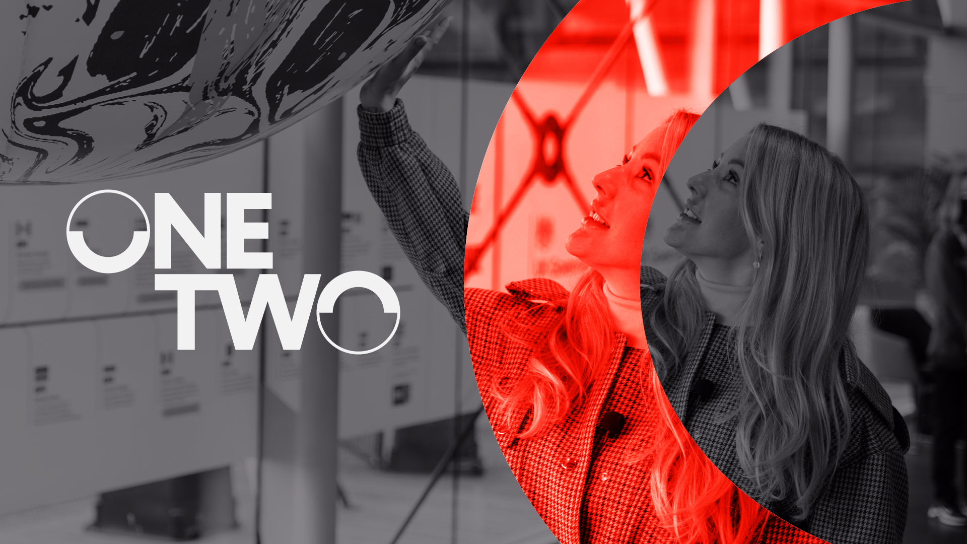
Brand // Communications // Design // Digital
GoShorty
Brand // Communications // Design
Black In Business
Our
Work
We add value to every project we work on, boosting our clients' brand positioning and creating design work that sparks interest and conversation. Our projects include identity design, website design and print design.
View all ProjectsBrand // Communications // Design // Digital