London Symphony Chorus
Rebranding the world-class London Symphony Chorus to reflect its future facing vision
Communications,
Design,
Digital
Following a competitive pitch, we were asked to recreate and refresh the brand – giving it a future facing feel but also recognising and acknowledging the rich history of the London Symphony Chorus – and to design and develop a new, accessible website that would attract a more diverse audience.
The new brand needed to be contemporary and recognisable, but also complementary to the London Symphony Orchestra, whom the chorus frequently partners with.
Brand development
Get in TouchWe firstly held a thorough brand workshop with around 20 members of the London Symphony Chorus’s council, through which we discovered the purpose behind the chorus – to inspire, excite, and deliver the best musical experience for everyone, no matter their background.
Based on this, we created a new brand that focuses on the emotional response the chorus provokes, and the passion and diversity that comes together to create one unified voice.
Visually, this translated the brand identity into unique mark, representing the physical sound of the London Symphony Chorus. We used a recording of the chorus’s four vocal ranges – soprano, alto, tenor, and bass – and ran the recording through digital visualisation software to look at the different ways in which sound waves can be imagined. Layered together, the circle represents the London Symphony Chorus’s unified voice, made up of its individual parts.
We chose a colour palette to mirror the four choral parts, joyfully inspired by the rich history of the era of the London Symphony Chorus’s inception. The colours are playful and engaging, whilst in application, still feel prestigious and world-class.
The brand’s new typeface aims to resemble the heritage of the chorus while its high contrast modernises it and gives variations to the weighting, to signify the refinement of the London Symphony Chorus and the individual quality of its members.
In the logo, the connect between the ‘P’ of ‘Symphony’ and ‘H’ of ‘Chorus’ resembles the connection between sound and people, which is at the heart of the London Symphony Chorus’s brand purpose.
To complement its partners, such as the London Symphony Orchestra, the logo is right aligned. This gives the perfect weighting and balancing for the two logos to sit together, allowing the brand to sit beautifully beside the London Symphony Orchestra but also stand proud on its own.


Following creation of the new brand, we designed and developed a new website to educate, inspire and, ultimately, encourage member sign-ups.
The website design was inspired by the visuals of the London Symphony Chorus’s brand in application across billboards. The website was first sketched out, and then wireframes were created to visualise the site structure. Following this, the brand design was incorporated, and code developed, producing a new, fully functional website.
We worked alongside an accessibility and inclusion group, formed by the London Symphony Chorus, to ensure that the website appealed to and easily communicated with a diverse audience.
As part of our work on the new website, we drafted the copy, reflecting the London Symphony Chorus’s defined values, brand identity, and tone of voice.
We also created social assets to utilise across various platforms, while bringing the brand to life through animation.


Brand // Communications // Design // Digital
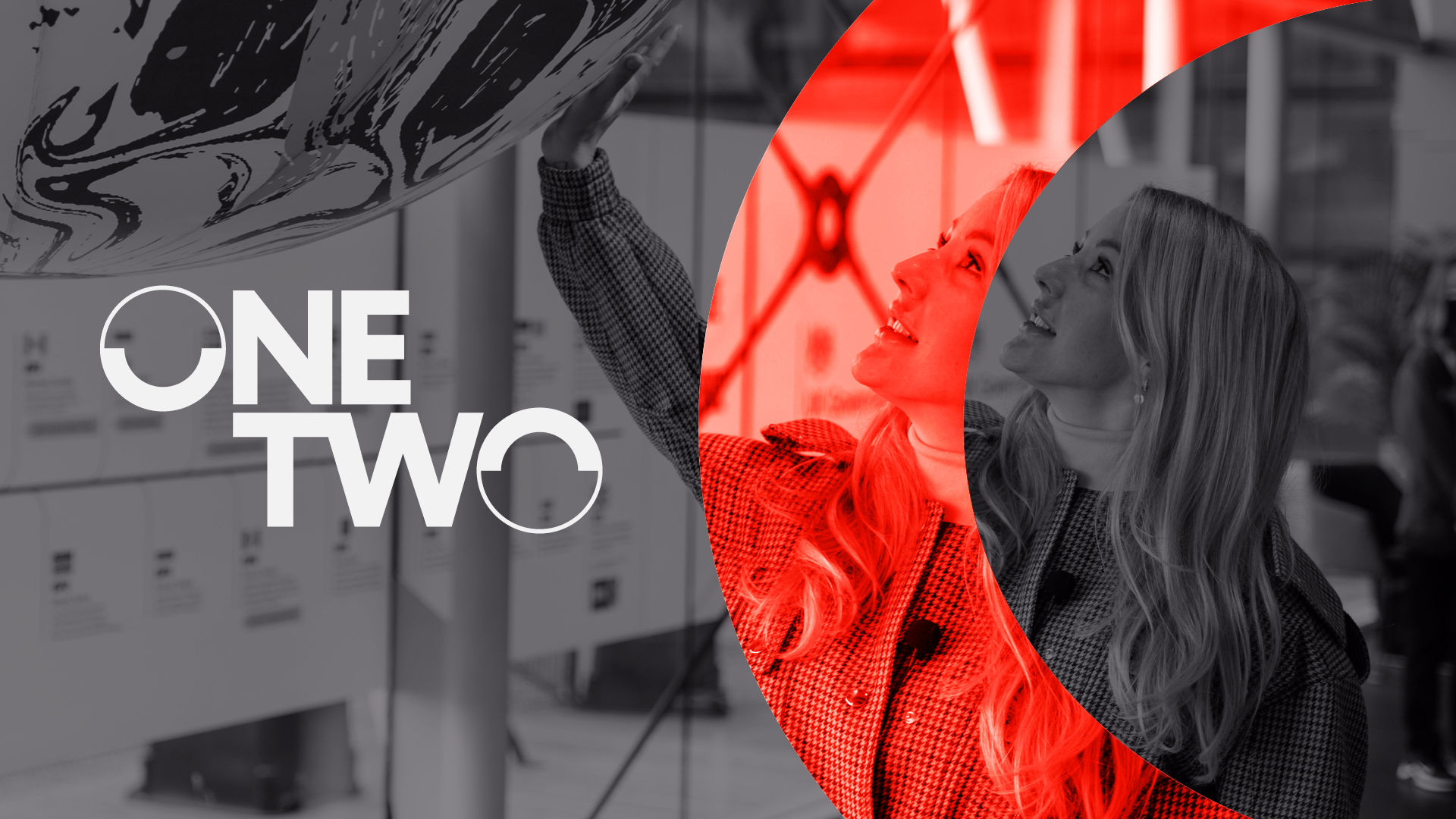
GoShorty
Brand // Communications // Design
Black In Business
Our
Work
We add value to every project we work on, boosting our clients' brand positioning and creating design work that sparks interest and conversation. Our projects include identity design, website design and print design.
View all ProjectsBrand // Communications // Design // Digital