Morecambe Football Club
Creating a consistent brand identity for the League One club
Communications,
Design
We were tasked to refresh and strengthen the Morecambe Football Club brand, ensuring consistency and cohesion across all its departments, to position Morecambe FC alongside other League One football clubs and drive it forward through its next season and beyond.


Brand Development
Get in touchWe began the brand process by gathering as much knowledge and insight into the club as possible. We held two workshops with key team members, including the Morecambe FC board, and created an in-depth questionnaire, for which we received an impressive number of responses from the club’s stakeholders. To further understand the industry, we also conducted research into Morecambe FC’s peers and other football clubs.
Through our research and brand development, one thing was clear – togetherness was at the core of Morecambe FC, which in turn cultivates a sense of community.
With this in mind, we determined Morecambe FC’s brand purpose: ‘to bring people together, on and off the pitch, to build a competitive and sustainable football club that is a force for good and source of pride within Morecambe and North Lancashire’. This clearly defines what the club stands for and how it works together to bring powerful change to people’s lives and the club’s future potential.


With the brand purpose outlined, we created a set of brand values to verbalise what the club believes in and demonstrated how Morecambe FC should live those values through a series of brand behaviours.
We then defined Morecambe FC’s brand voice to guide its future communications, reinforcing a warm, friendly, and confident tone of voice coupled with positivity and inclusivity to reflect the togetherness of the club. Morecambe FC’s brand voice should communicate its spirit, passion, and ambition, while inspiring its fans and team and ultimately driving the club forward.
Following this, we created a set of straplines for each department of the club, which reflect the overall Morecambe FC brand but are individual to each unique area. Building on the idea of togetherness, we ensured that all messaging was consistent to create a sense of deep-rooted partnership between each department and build brand cohesion.


Design
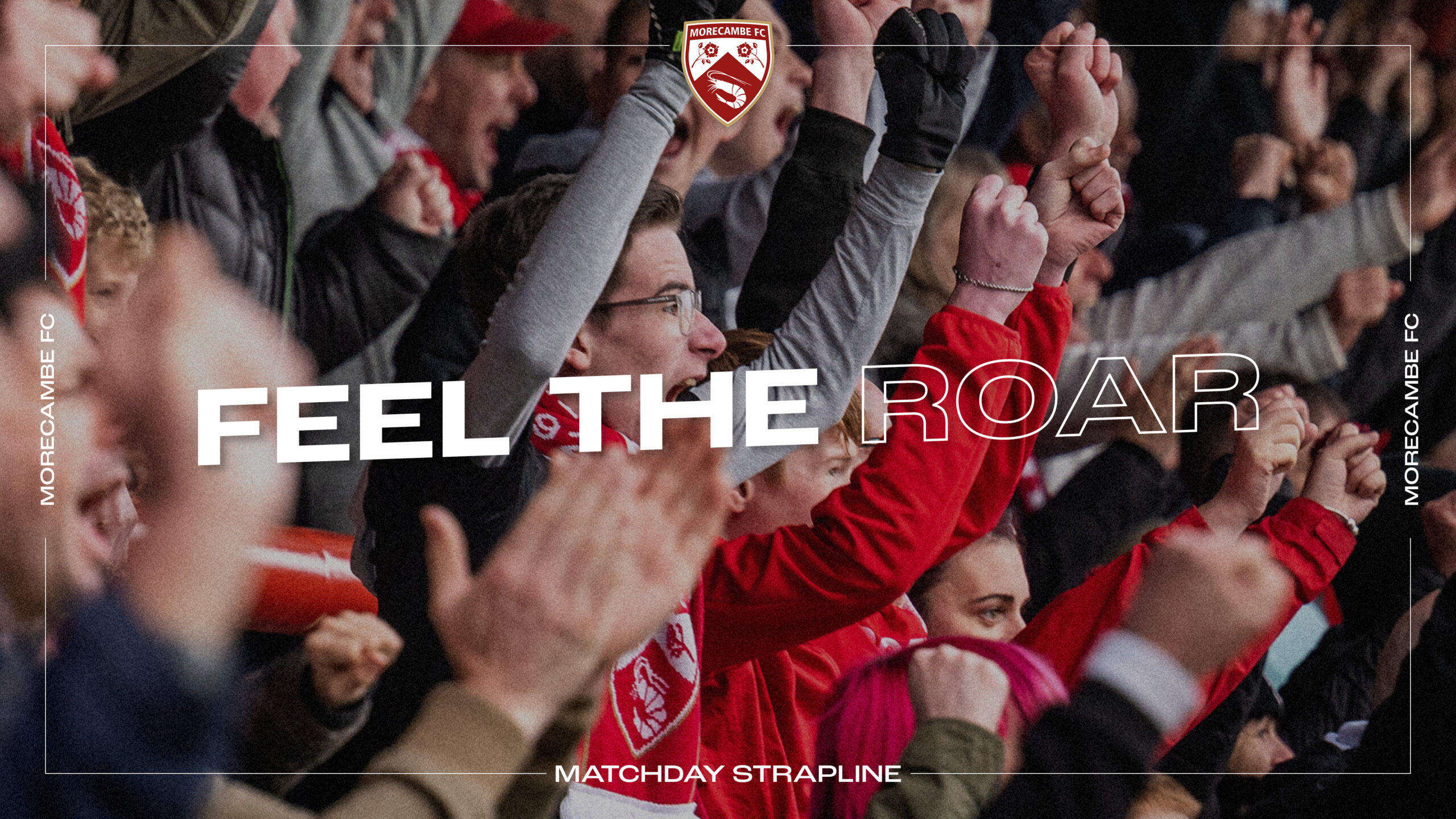
Get in touchAligning seamlessly with Morecambe FC’s brand purpose, when creating the brand we were inspired by the successful ‘Feel the Roar’ end of season campaign we designed for Morecambe FC, which centred on emotive fan photography.
To bring the brand purpose to life, we directed a photoshoot on the Morecambe FC grounds to take new candid, real-life photography of fans and the team and staff on a matchday, capturing all the emotions on and off the pitch.
We then introduced a brand device inspired by the white lines around a football pitch and the wide focus frame of a video camera, which is used to capture the action. This line device creates a focal point and when combining this with the photography, puts fans and team at the centre of the imagery.


To further align the brand visually, we created cohesion between Morecambe FC and all its departments – Morecambe FC Commercial, Morecambe FC Events, Morecambe FC Community Sports, and Morecambe FC Academy – through use of logos, a core colour palette, typography and the brand device and crest, which are now seen throughout the club’s design work.
Typography reinforces the brand personality and ensures continuity across all brand communications. The wider sans serif typeface modernises the brand and positions it alongside its peers within the industry.
Since preserving the club’s heritage was a fundamental part of the brand refresh, we formalised the existing brand colours, defining each colour and naming them after key parts of the club’s history, such as Christie’s Red – named after the former President J.B. Christie, Morecambe FC’s first home namesake.


Season ticket campaign
Get in TouchWe worked with Morecambe Football Club to create its 2022/23 season ticket campaign. The project involved designing the campaign launch assets, which were used across social media and out of home, including buses and billboards.
Building on last year’s initiative to make watching live football accessible and affordable, the campaign concept was based on the idea that the more season tickets sold, the better the value. To visually show the number of season tickets sold during the campaign, we designed and developed a webpage featuring a totaliser, which aimed to keep fans informed and up to date with the progress of the campaign and how close they were to securing a lower ticket price. The campaign was a huge success and saw a record number of season tickets sold.
The original season ticket card was unbranded, so we designed a card, featuring the new brand, to create consistency across all touchpoints. The new season ticket received incredibly positive feedback from Morecambe FC fans.


Testimonial
Get in touch“The team at Two Stories have done a wonderful job in helping us identify and define our brand, interacting with a variety of key stakeholders to arrive at an appropriate and meaningful destination. Two Stories work tirelessly in their support of our needs, including designing and updating our physical output, sometimes at a moment’s notice, advising us on the best ways to communicate our ideas both internally and externally, and all in all ensuring that we have a consistent and modern feel at all touchpoints. We couldn’t recommend Two Stories any higher!”
Ben Sadler, CEO


